Andrei Vidaicu logo Andrei Vidaicu

Study Group logo

PayOnline

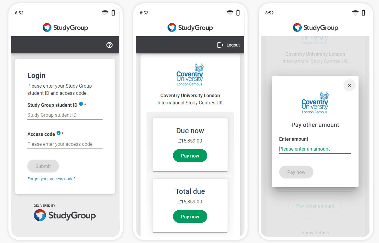
PayOnline enables students to view their account summary, track their payments, check outstanding balances, and more importantly pay their fees. Agents are also able to perform these actions on behalf of the students.

The user interface of the previous system was outdated, cumbersome, and non-responsive. It lacked modern usability standards, making it difficult for users to navigate and complete tasks efficiently. This led to an increase in the number of support tickets, primarily due to user interface issues.

The team for the project included a business analyst, a project manager, five engineers, the head of IT Solutions and myself as the lead UX/UI designer.

Application fee

My work began on the main requirement of reduce the number of application forms submitted by agents, aiming to improve resource efficiency while boosting conversion rates. My role focused on this crucial point in their journey of where they are required to pay an application fee for each form submitted.

Approach

Working against a tight deadline, to get a better understanding of the problem space, I:

  • reviewed the old system and noted its strengths and weaknesses.
  • tested the old legacy system with an agent and three students.
  • synthesized the information we had gathered.
  • created a customer journey map.
  • organized a team meeting to decide what to focus on first.
  • created a user flow diagram illustrating how agents and students navigate through the system, followed by a testable low-fidelity mockup.

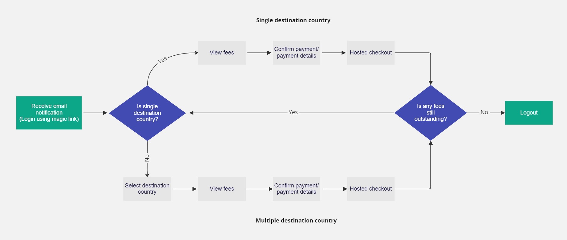
The image below depicts the ideal student journey within PayOnline, showcasing both single and multiple destination country options in the user flow.

Application fee user flow

One of the key priorities from the ideation workshop was:

What is the most efficient way to display application fees per destination country?
  • Initially, we displayed the countries in a select list alongside the application fees on the same page. The fees would only appear once a selection had been made. However, this approach had a downside: students might mistakenly believe they were required to pay for all the countries they had selected.
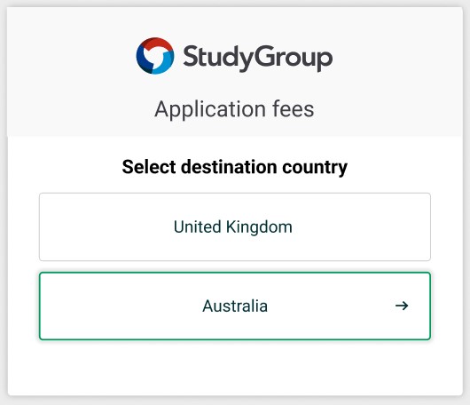
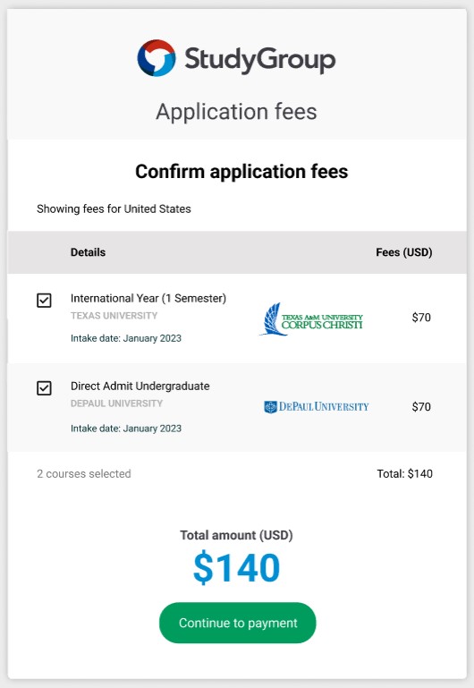
  • We split this into two steps to clarify that only one selection can be made, thus reducing cognitive load.

Step 1 – Select destination country.

Select destination country

Step 2 – Confirm application fees.

Confirm application fees

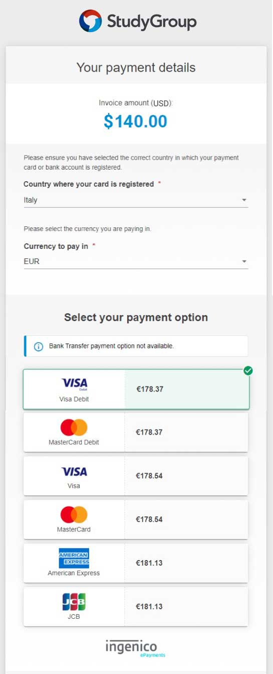
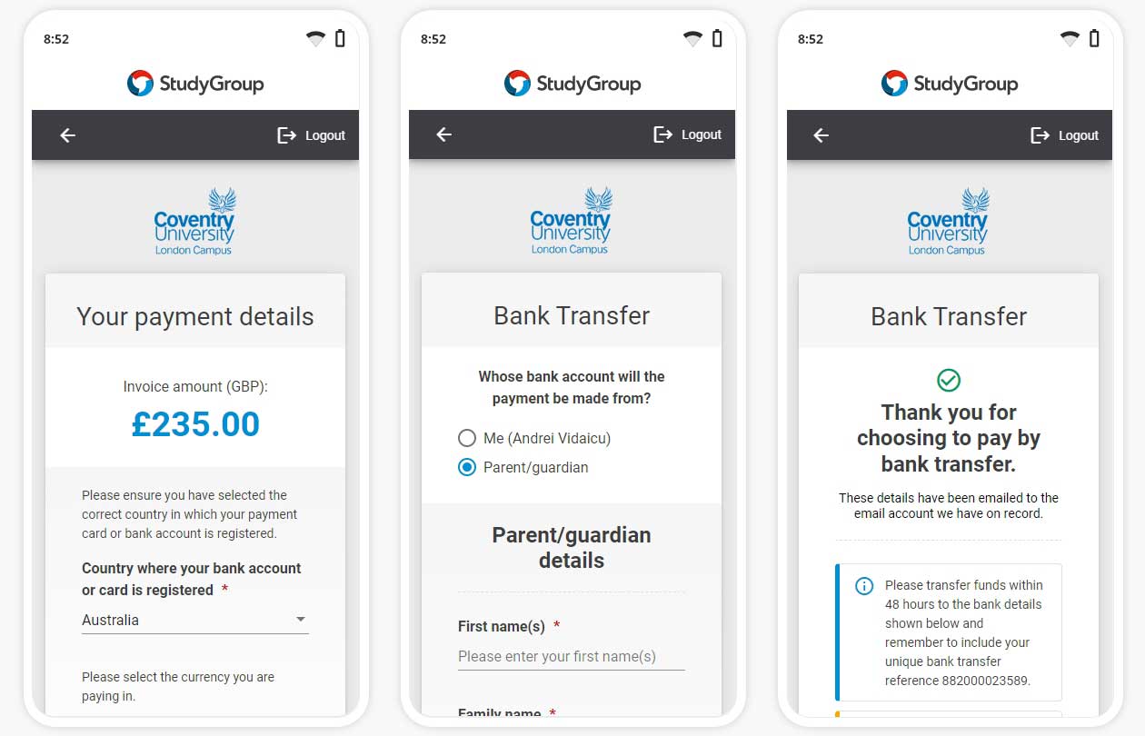
The final payment details screen.

Payment details
Payment status

Conclusion

This project demonstrates the importance of user-centered design, even when primarily focused on achieving business goals. Here are the key insights we gained:

  • Doing research and testing is valuable, even when time is short.
  • Breaking down complicated tasks into smaller, easier steps.
  • It's important to think about how users might misunderstand things and small tweaks can prevent confusion.
  • Working together to come up with ideas and decide what's most important leads to a better design.


PayOnline - Mobile top
PayOnline - Mobile bottom

Lacking flair with purpose. My website contributes to a more sustainable digital future♻️. Learn more