
Standardising user consent through a design system component
I helped create and rolled out a framework to handle privacy compliance that all NSW government departments now follow.

I helped create and rolled out a framework to handle privacy compliance that all NSW government departments now follow.
We've received multiple requests from various NSW government departments for the need to create a cookie banner, to strengthen privacy information by gaining user consent, particularly for those using analytics tools, such as heatmapping tools like Hotjar. According to one privacy team member:
This marked the beginning of our journey to design a cookie banner that would standardise a reusable cookie banner which would allow users to have more control over the storage of their personal information while enforcing compliance for NSW government agencies.
The research aimed to determine whether a cookie banner component should be included in the NSW Design System. Given our tight schedule, it was important to make our research activities quick and focused. The primary objective was to gather actionable insights to inform better design decisions.
Engaging with privacy team SMEs highlighted key privacy concerns and the need for a stricter tier for GDPR and CCPA compliance, especially for agencies interacting with European organizations. It also revealed risks such as higher bounce rates and the potential impact for marketing teams on measuring performance.
During this phase I started sketching various common use cases by mapping user stories where two common tiers were identified based on the strength of privacy.
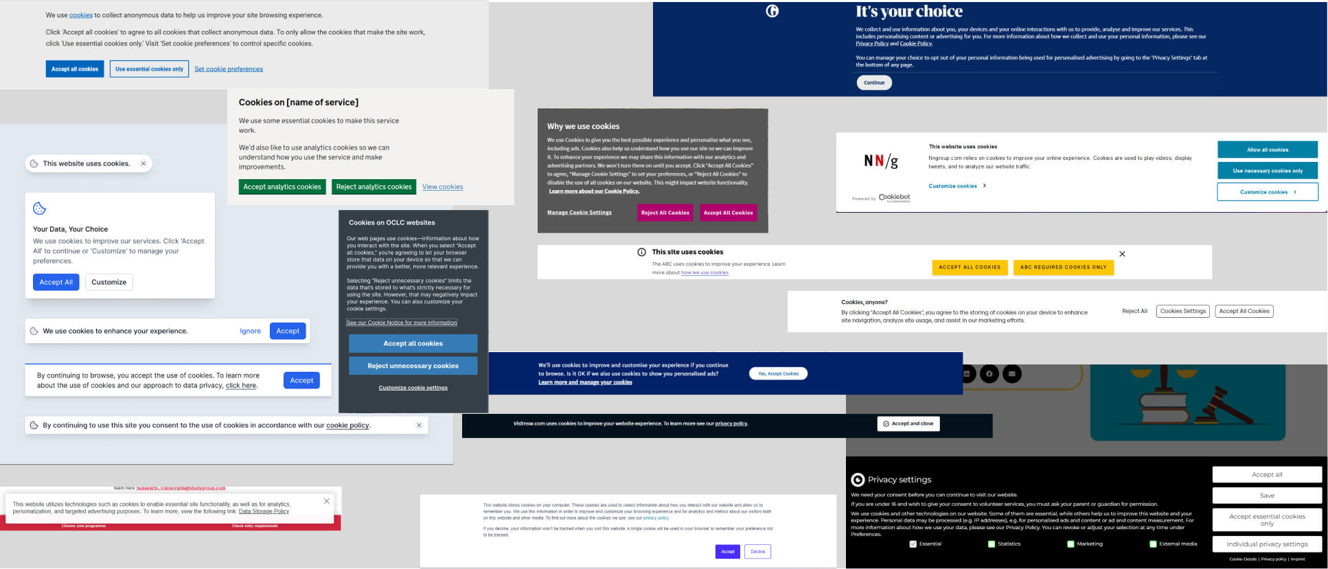
I evaluated 48 customer websites and competitor design systems looking at common themes, and identifying potential gaps. The purpose of the evaluation focused on:
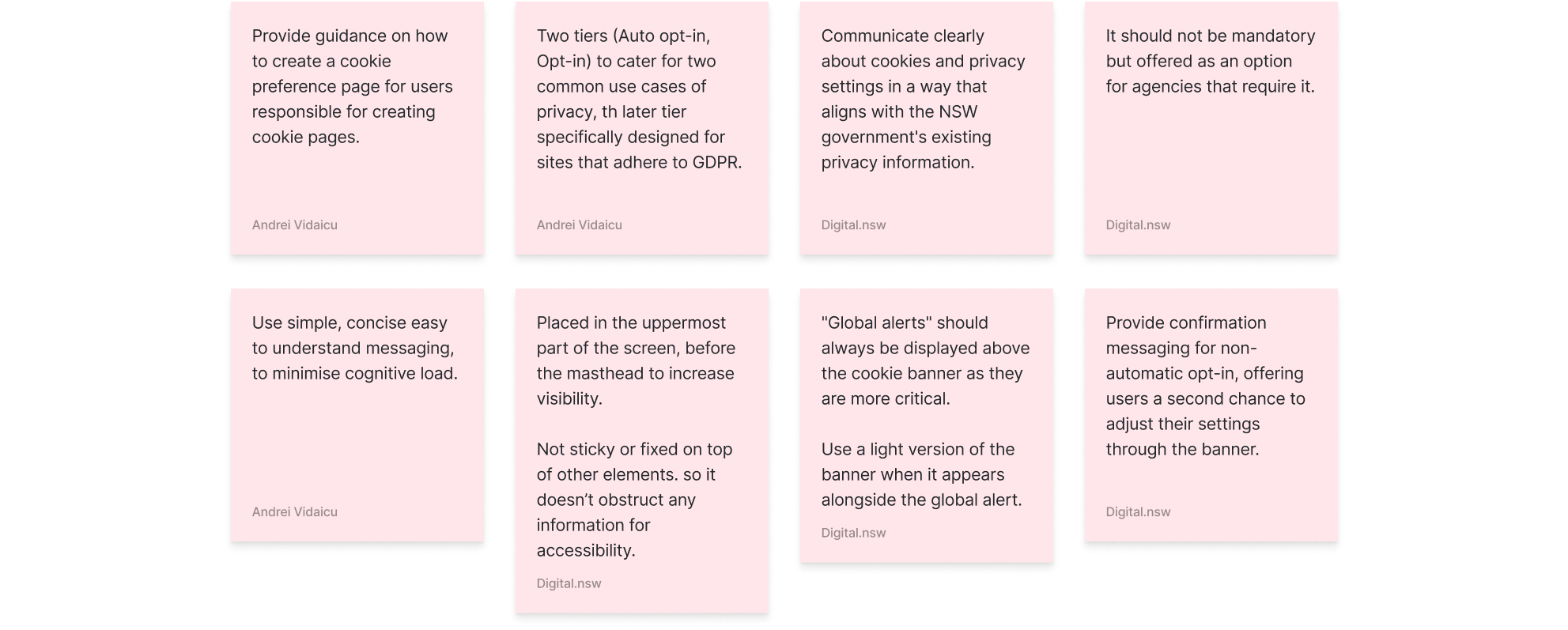
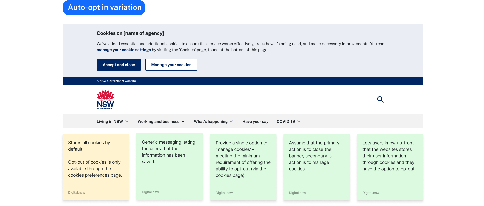
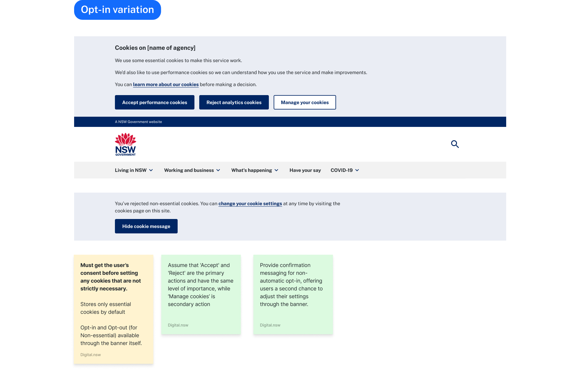
The creation of the banner involved me looking at common elements between each tier, looking at which smaller components from the NSW Design System could be used and how they fit together. By focusing on reusing these modular components, I established a solid foundation that addressed potential accessibility issues and ensured they displayed correctly across various devices and screen sizes.
Given the high priority of accessibility in government, placement played a key role in the design. Although 80% of the banners reviewed were fixed to the screen, risking content obstruction and disrupting the reading order for users who rely on tabbing to navigate - this consideration was crucial. As part of the process, I also examined other UI elements, such as the Global Alert, which could potentially appear simultaneously in the same position. This assessment considered display priorities and potential conflicts, including micro-interactions and color usage.

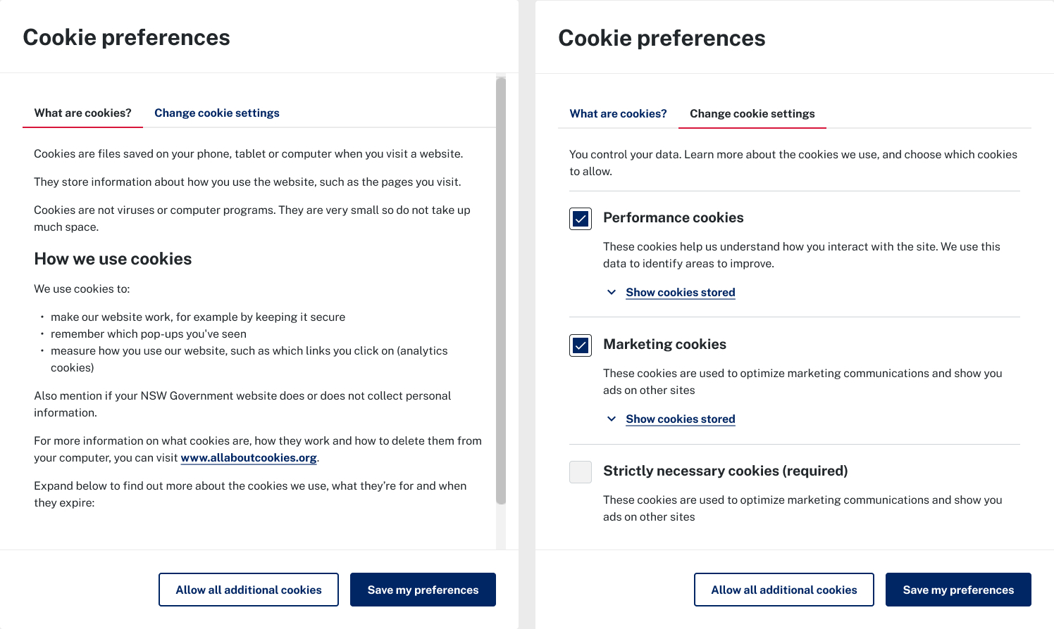
The design of the banner also included an evaluation of the cookie settings being displayed - comparing a modal approach versus a separate page on the website.
 Testing
Once we had a clear understanding of the design requirements, I created a prototype, allowing us to evaluate how well it met the needs of our customers and their users.
Listening to feedback from the communityThe addition of the cookie banner component to the NSW Design System has marked a significant milestone and we hope it becomes a model for all Australian government websites. It shows the design system's ability to adjust to a variety of use cases while setting a solid foundation for future implementations. Moving forward, we plan to keep refining our approach based on the feedback we receive.

♻️ Lacking flair with purpose. My website contributes to a more sustainable digital future. Learn more