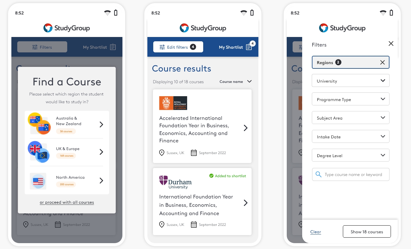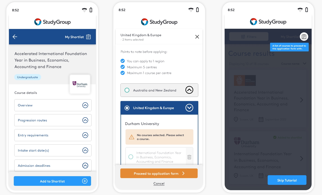
Helping agents select courses for their students at fairs and events
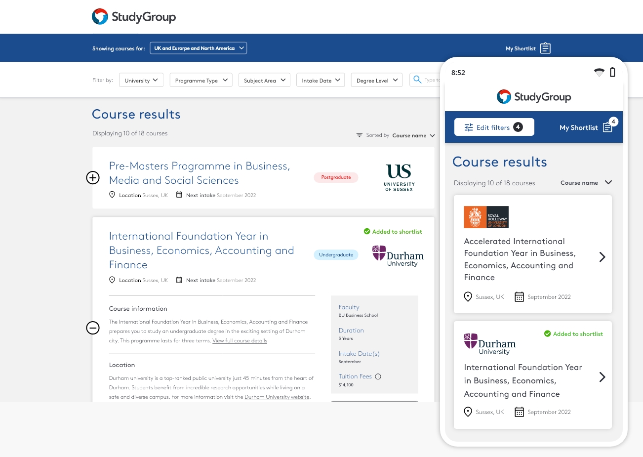
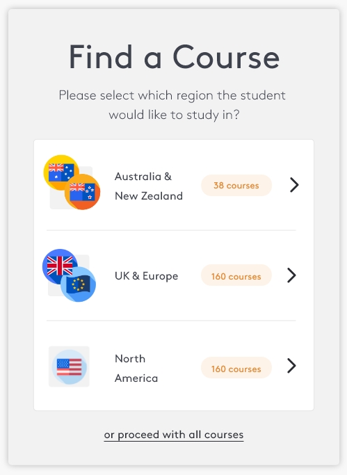
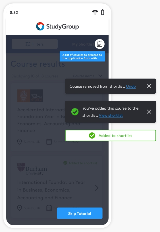
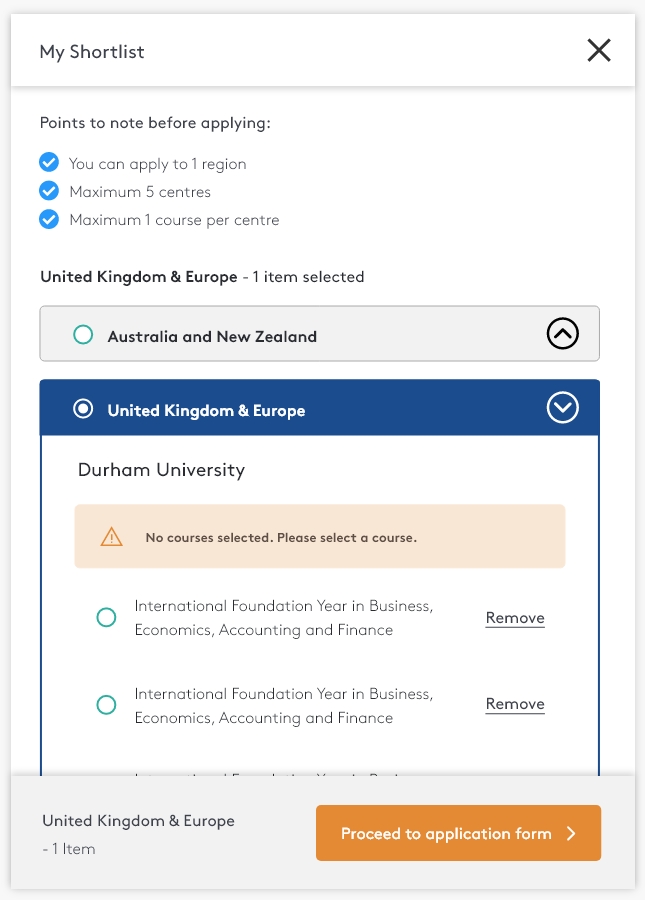
I helped create a website leading to faster student recruitments and increased enrollment rates during recruitment at fairs and events.
Due to substantial changes in the higher education landscape caused by the COVID-19 pandemic, there is a pressing demand to increase agent satisfaction and onboard new students by converting submitted agent application forms.
Feedback from previous surveys on agent satisfaction show dissatisfaction with the Course Finder tool. As one remarks:
“Course finder should present relevant information clearly and concisely at first glance.”
In Q2 2022, a request was made from marketing to implement a Minimum Viable Product (MVP) to improve user experience and increase agent satisfaction.
I was responsible for overseeing the design process from concept to final implementation. This involved conducting foundational research to gather insights and opportunities, generating initial concepts, exploring design solutions, providing regular progress updates to cross-functional teams, and the delivery of the final assets for the build phase.
Making it work for agents
The target customers are agents during counseling sessions with students and parents - this can be used both in their office or at fairs/events, with the end goal of converting enquiries into applications.A fresh encounter
- In scope: Meet the needs of the project as a minimal viable product (MVP).
- Scalable: Be able to easily add new features in future releases.
- Responsive: Agents are likely to access using a mobile devices at fairs and events.
 Andrei Vidaicu

