 Andrei Vidaicu
Rediscovering the NSW Side Navigation
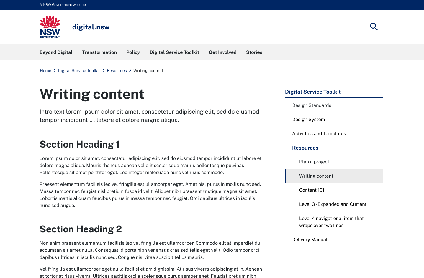
The NSW side navigation allows users to see their current position in the site hierarchy and navigate between related sections of the site.
A recent audit of our customers websites showed that they are heavily nested deep within the site hierarchy - some up to five levels deep. This was an initial indication that there might be a need to further improve the NSW Design System side navigation component.
Small changes cascade down and make a big impact hence the importance of learning and growing with our customers as well as testing our assumptions.
Requirements
The initial phase aimed to enhance the existing static version.
- Visible on larger screens, hidden on small screens - accessible through a secondary menu navigation in a later release.
- Can appear on both the left and the right hand side of the page.
Discovery
The Digital NSW community website was used to gather feedback.
Some of the feedback received:- As subsections grew users found the indent hard to follow.
- As subsections grew the red highlight lost it’s value and no longer aided the site hierarchy.
- Users found the UI cluttered and hard to group content.
A usability evaluation revealed some key usability issues.
- Conflict with the red highlight: The side navigation frequently appears on pages that contain a 'On this page' section containing the red highlight.
- Parent and child relationship is hard to establish, especially when below the fold of the page.
We also explored a range of other leading government side navigations menus which gave us some additional insights into emerging trends and best practices.
Regular engagement with our customers and collaboration with other designers, developers, stakeholders, and our design system partners (OneCX and Service NSW (GEL)), helped build a solid foundation and reveal the key areas to focus on moving forward while refining the design iteratively.
Evaluation
An initial prototype aimed to address feedback we received as well as test some of our assumptions around usability.
Key takeaways:- Non active main category and category relationship is hard to establish when categories appeared at the bottom of the page (below the fold).
- Level 2 items were inconsistent with the other levels.
- At first glance it's not easy to distinguish the nested levels of hierarchy.
- Users could not identify between the levels of hierarchy in a timely manner.
Learnings and takeaways
A pivotal part in the success of the side navigation component was refining and iterating on the design based on the recommendations from the testing as well as the engagement with our customers and our design system partners early on.
Design overhaul vs documentation updateOne of the lessons learned is that I would have liked to to test if there was a need for a complete redesign vs recommending to building less nested sites through the documentation. For the latter it would change the problem to be solved.