
Uniting seven Digital NSW branches under a new digital front door
The redesign of the Digital NSW website homepage helped lower bounce rates while providing the seven branches an equal piece of the pie.

The redesign of the Digital NSW website homepage helped lower bounce rates while providing the seven branches an equal piece of the pie.
Through continuous feedback from our customers, several deficiencies have been identified on the Digital NSW website. Users struggle to find information, face unclear process guidance, lack structured pathways, and encounter complex content. Meanwhile, stakeholders desire a more equitable piece of the pie.
I've had the opportunity to be part of a hard working team, my role is to lead the design activities, identifying gaps and turning them into actionable opportunities.
The Digital NSW website serves government departments and public servants who visit the site to find information relevant to their work.
The initial problem presented to us was too broad. Based on our constraints, feasibility, and more importantly to stay within scope, we identified three key tasks - one of which would be realistically achievable within the scope of an MVP.
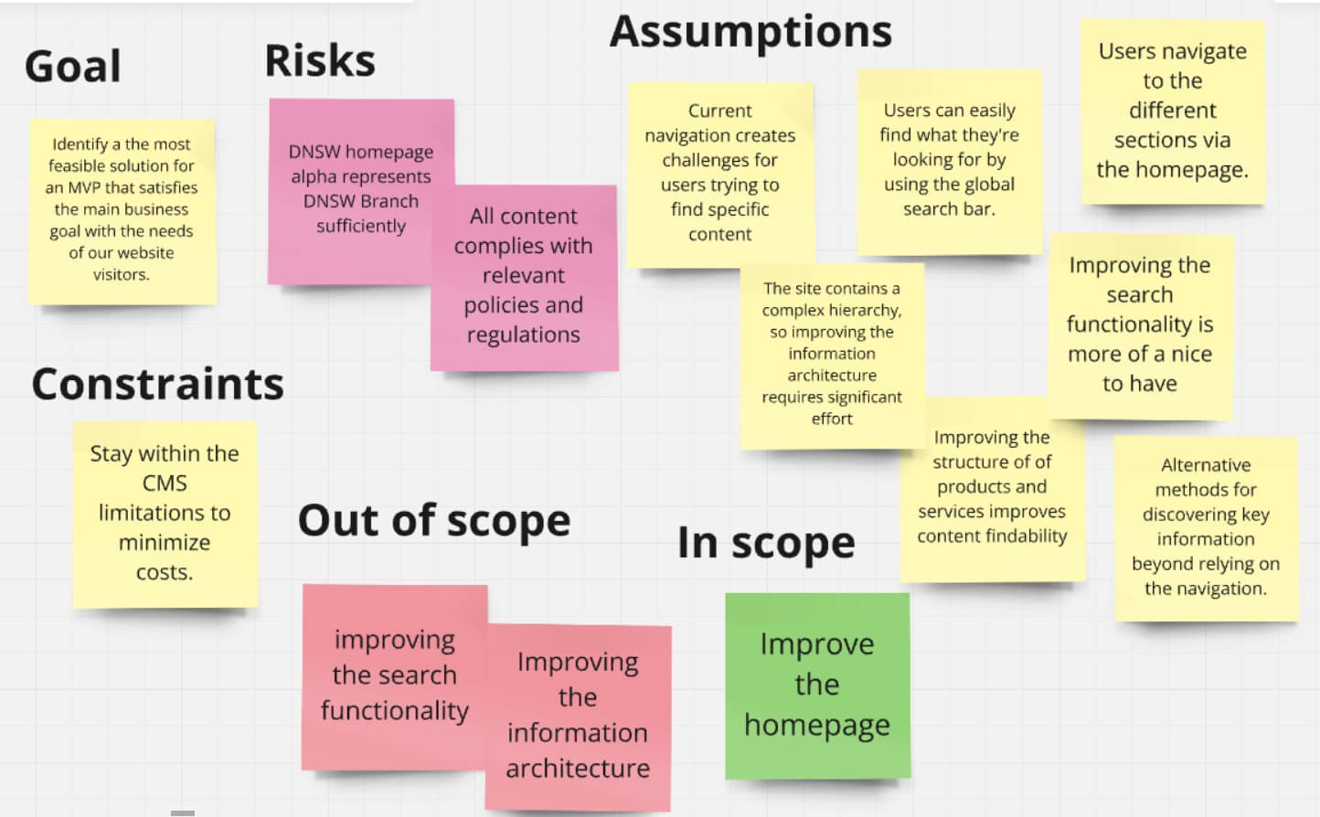
Improving the homepage proved to be a quick win that provided us with a focused, achievable problem to tackle, while staying within scope.
Back to the drawing board...
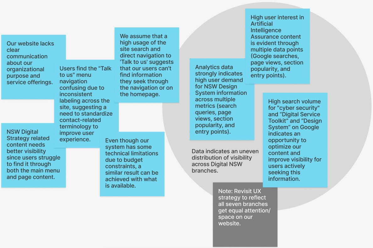
I grouped the findings from various data sources into a repository to find patterns which helped form insights. These findings helped us prioritize the roadmap of work, identify any risks and gave the team clear direction on the problem we needed to solve for the homepage.
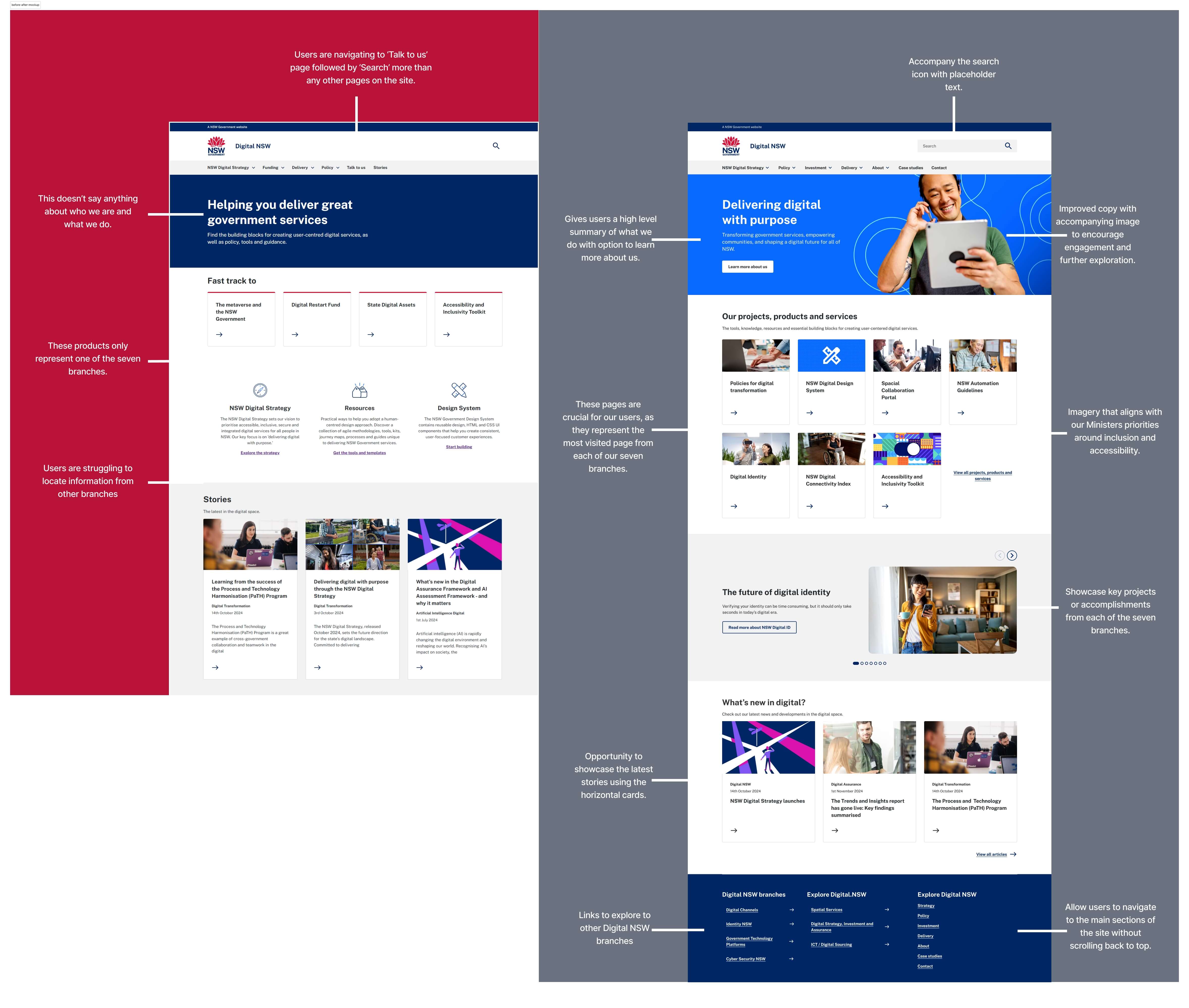
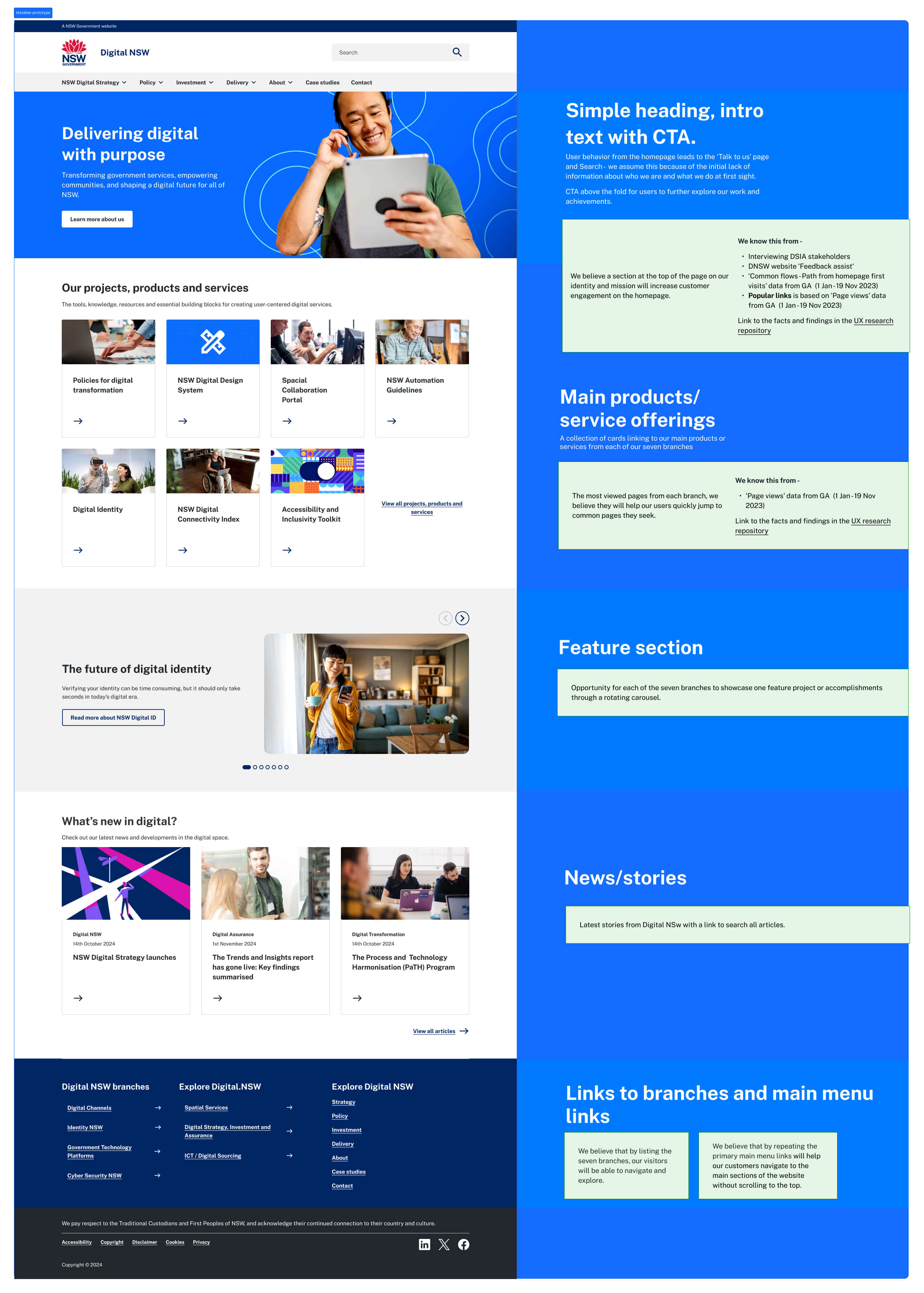
Through the analysis, this project demonstrated the value of aligning user needs with a main business goal - we achieved an equal distribution of the seven branches while considering our users with the information they seek to find. We stayed within the scope of an MVP, within budget, and didn't set out to reinvent the wheel. Instead, we focused on making small, incremental improvements to the current design, utilising the existing components available in the CMS.
Moving forward, we plan to continue gathering user feedback on these changes and make further refinements as needed.
♻️ Lacking flair with purpose. My website contributes to a more sustainable digital future. Learn more